
Co-branded credit card
application journey

YES BANK MWeb funnel in total had 9 steps within which there were several issues :
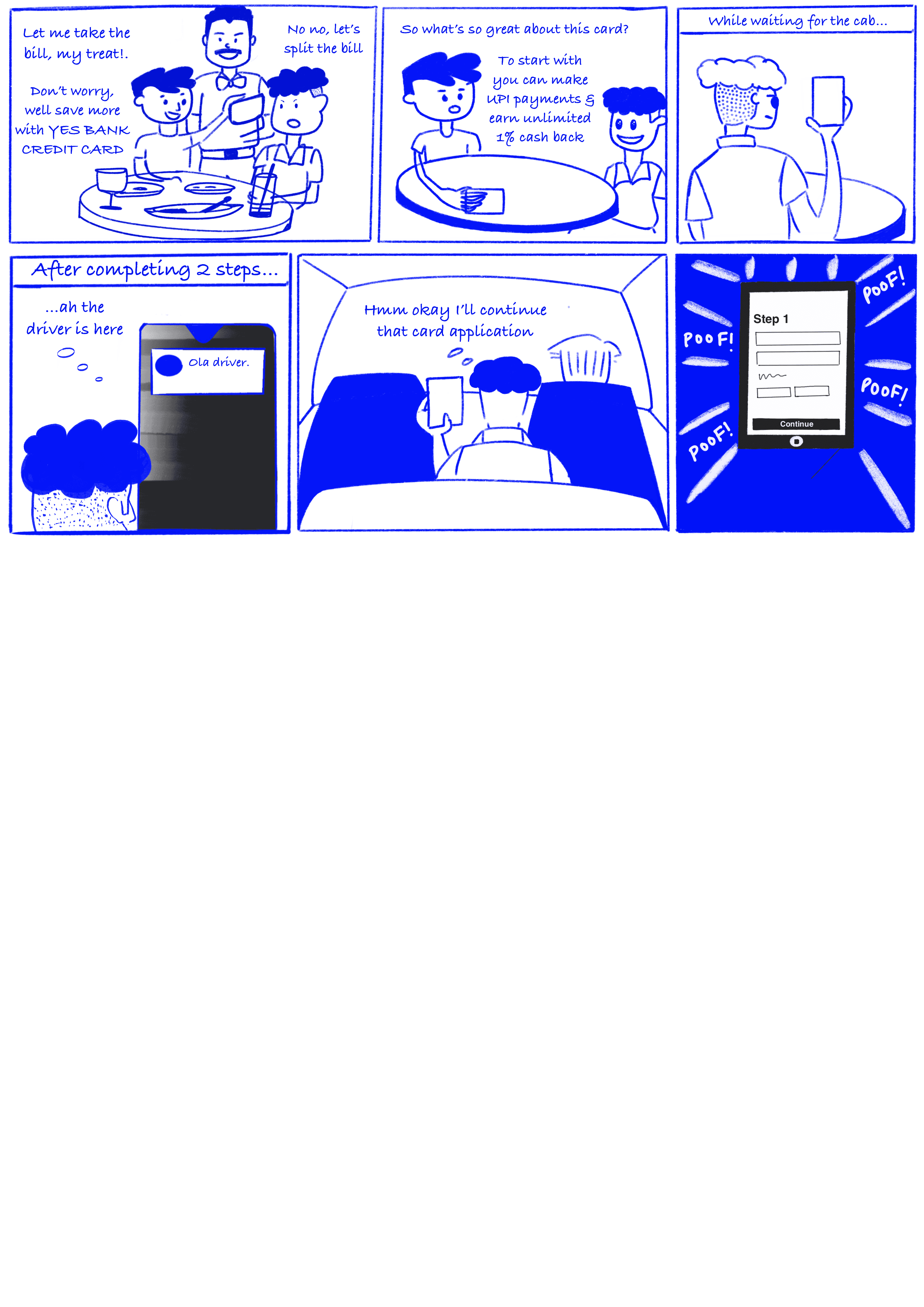
We launched the Freo Yes Bank credit card in August 2023. The application process involved redirecting users to Yes Bank's web portal to complete the onboarding journey.
The eligibility criteria for credit card are:
• Between 21 and 60 years of age
• Salaried or self employed
• Minimum net salary of INR 25,000 per month or ITR of INR 5 lakhs
But despite spending more on this partnership than on others lead to
• lower approval rates
• high number of drop-offs
• TAT was around ~17mins.

Background
• Sales is not higlighting
credit card’s main feature
• Vague form fields and options
• Too many unneccesary steps for compliance
• Not leveraging existing customer data to create a seamless experience
• No way for users to resume their application form
• Handling errors and redirection to other similar products

Insights & UX considerations
Since this was a completely new product for Freo, I took it to our customer success team to understand how Freo’s Large to Mini credit line (LCL & MCL) users have experienced our Moneytap RBL card product since. Of course during this time, my PM and I had calls with folks from YES BANK and the marketing team about how our existing funnel is performing.
Applying the 80-20 principle here, I got started in figuring out the main flow and the complications we might face, questioning the PRD and ironing out most of the edge cases.
But for the sake of this case study, and the reader’s understanding I’ll got the other way round and start with the sales page first.
YES BANK’s approach was like any other credit card out there which only talks about benefits, while that’s the reason why users get credit card’s but wasnt the main USP of this one.
1.1 Sales page
How we got there?
Opportunities
By implementing a native journey within our app, we will have complete control over the user experience. Which also meant :
• Converting to a step funnel
• Utilising Freo's larger database
• Retargeting of users
• Reduce marketing funnel costs & increase no. of good quality leads


when I went through YES BANK’s features and benefits, the main USP was clear.
For terms and conditions YES BANK wanted users to individually check all
TERMS & CONDITIONS but we felt this would create high drop offs
Iteration 1 : What if user can earn while spending their money through multiple networks and also get additional benefits over the year?
Iteration 2 : A different visual direction where the light theme bottom sheet sales is creating enough contrast to pique user's attention
Iteration 3 : Credit on UPI as a concept has been the talk of town and a good quality lead for this credit card would’ve heard about it. Tapping in the recall this might have with users
Iteration 4 : Harped on the convenience aspect of multiple networks of the credit usage & that they could earn while spending credit

For terms and conditions YES BANK wanted users to individually check all
TERMS & CONDITIONS but we felt this would create high drop offs

We clickwrapped all the T&C's under one Term to reduce the no. of clicks & time to complete the form
• Traditional Credit Card Payments : Generally not integrated with UPI, relying on traditional card payment methods (POS terminals, online card entry).
• Higher reward accumulation : Users are rewarded for each UPI purchase.
• Separate UPI Transactions : Users need to manage UPI transactions separately from their credit card transactions.
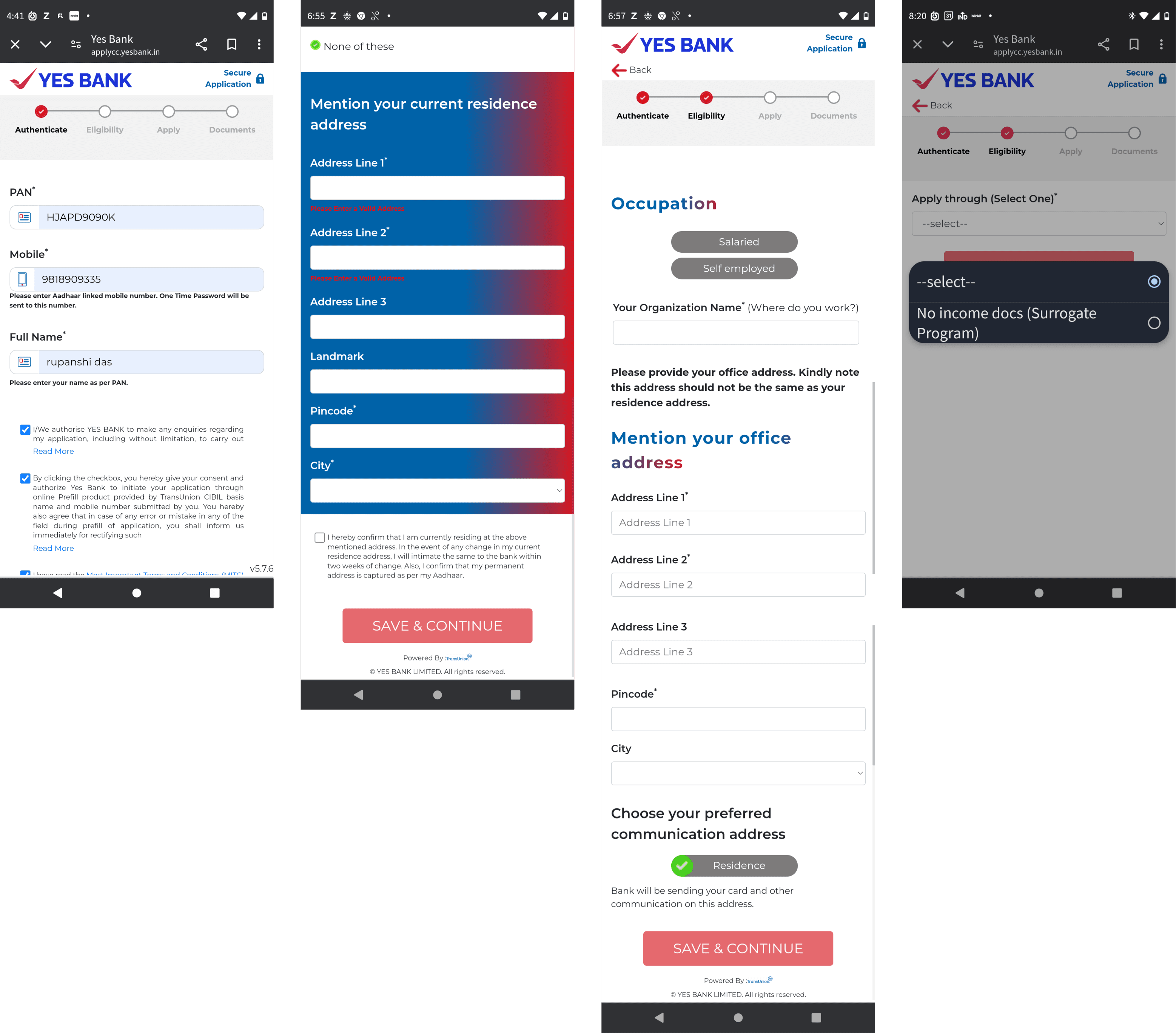
1.2 Employement details
Employment details was 1st step to decide whether we wanted to filter out bad quality lead out of the funnel, after a few discussions it was clear that even though these customers are not qualified for this credit card, we can cross sell them other products like nano & micro credit line to help increase their credit score!
Another point of discussion was whether to include company address with company details or to break it up into another step.
From YES BANK’s side they wanted to handle office and residential address mismatch in the residential address step, which was bad experience especially when we could avoid it from the very beginning with a simple tooltip
✅ Reduces perceived form length
✅ Showing professional details based on the selection reduces the need for recall
❌ Showing too many fields at once could overwhelm the user
✅ Moving to a new page for professional details gives a sense of progress
❌ Adds another step
Drop-off banner
✅ Reduces perceived form length
✅ Showing professional details based on the selection reduces the need for recall
❌ Showing too many fields at once could overwhelm the user
1.3 KYC
💡From our earlier experiences, we saw people tend to scan rather than read, so when they see the word "number," they often enter their mobile number by mistake.They only realise the error after receiving an error message.
❌ This was an issue because multiple Aadhaar verification attempts, while not hard pulls, could still slightly affect credit scores.
✅ By removing the word "number" and keeping the copy front-loaded, we reduced these mistakes.
✅ Conversational UX copy with a clear idea of what’s expected at the moment and what’s coming or to be expected next
✅ OTP field was kept generic so as to accommodate adhock regulation changes, it could be 4 or 6 digits
1.4 Personal Details
We could auto-populate fields like Father’s name from their Aadhaar card that we fetched earlier,
while the last 2 steps are pre-filled to reduce application rejection
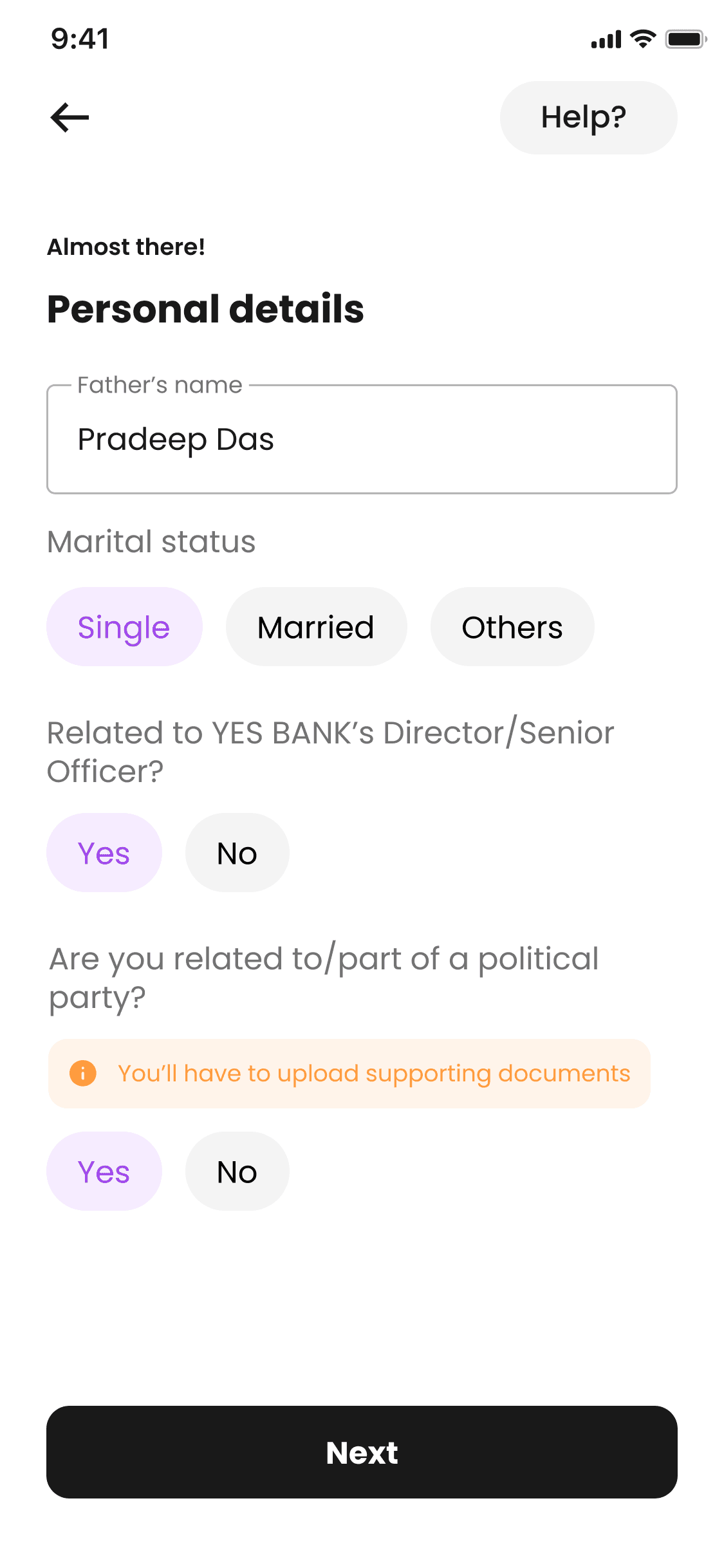
If the user is related to a political party then they are already waitlisted/rejected for the product.
It was therefore redundant to ask them to upload documents instead it was an opportunity to nudge them to choose “NO” by bringing clarity about what does PEP actually mean?
some copy iterations for the same
✅ We integrated haptics and sound effects into buttons using Android's ‘Vibrator’ class for tactile feedback and ‘SoundPool’ for short audio cues, enhancing the user experience with immediate, multi-sensory responses to interactions.
❌ But 2 actionable for the same objective felt redundant & would add confusion
✅ Maybe the effects could be an after thought and the main task of selecting the name should take precedence.
❌ The screen looks too cluttered!
✅ Tried reducing the clutter by keeping one name at a time
❌ Will take 4 scrolls to view all options
✅ Tried matching the card’s & form’s aesthetic and keeping light theme
❌ The continuity isn’t justifying a magic moment in the flow
This step came after user having to give so many details, so it was important to delight the users in some way. Since there wasn’t a lot of options to customise the card I took a
heavy UI explorations
The logic for what kind of variations will show up for personalisation goes something like this...
1.5 Card name personalisation

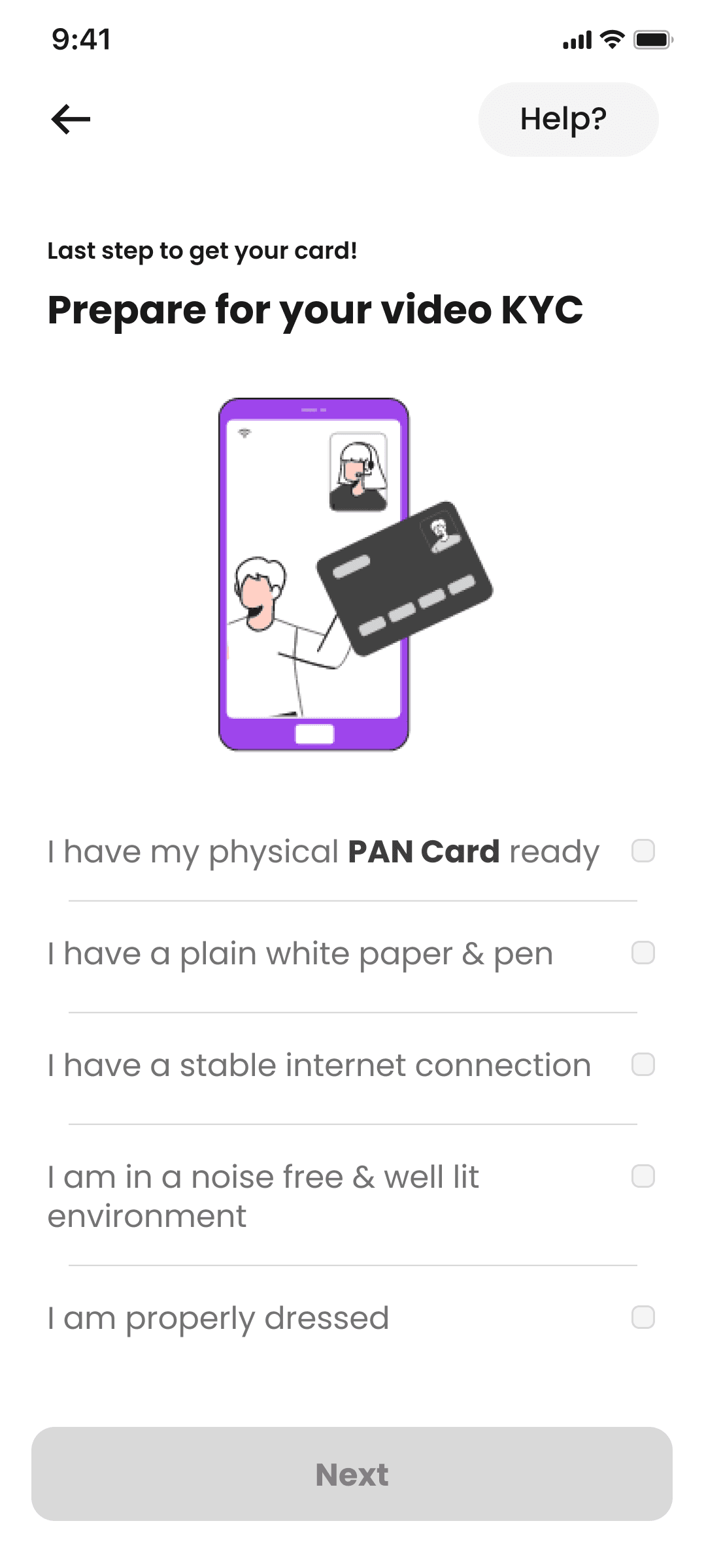
1.6 Video KYC Education

✅ Quick to understand, banking on visual recall
✅ Engaging & reduces cognitive load
❌ Users might miss or misinterpret details
✅ Ensures users read and acknowledge steps, detailed
❌ Might be overwhelming

✅ Guides users to check readiness & reduces errors
✅ Interactive
❌ Will slow down the app & app might crash on budget phones
1.6 Video KYC Education
Happy flow
We wanted to integrate the video KYC process in iframe for multiple reasons like :
✅ Seamless branded experience & embedded customer support
✅ To handle error scenarios better
✅ Avoid connectivity issues and drop offs during transferring to bank’s portal
But it also had downfalls like :
❌ Data handling & privacy risks clickjacking, phishing & cross site scripts
❌ Complicated compliance regulations such as DPDPA (Digital Personal Data Protection Act, 2023)
❌ Tech bandwidth crunch to integrate a new API
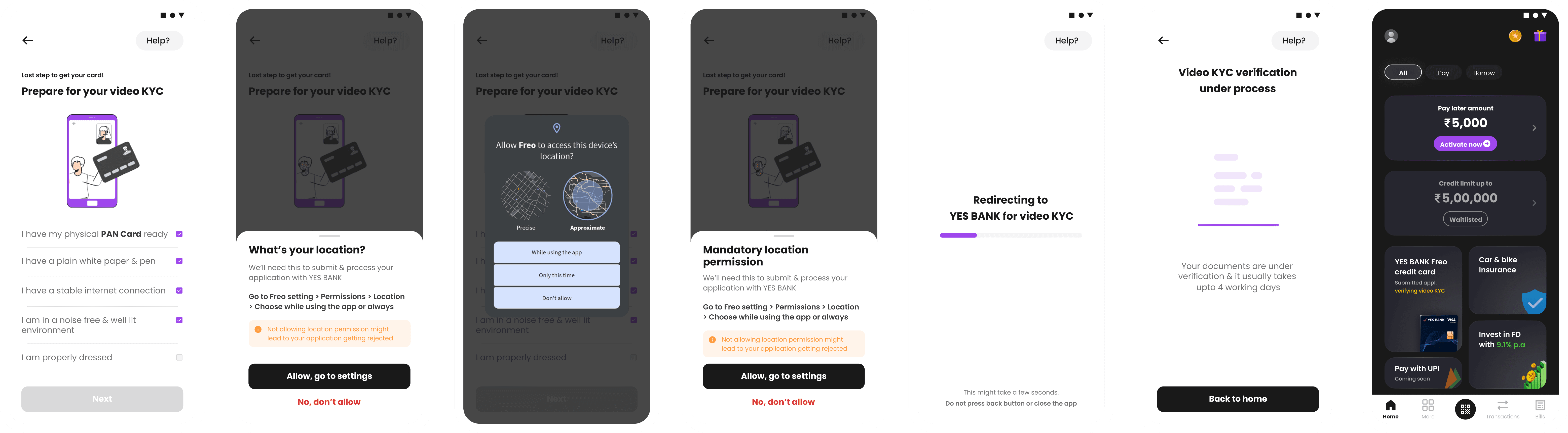
Since the cons outweighed the pros we went ahead with YES BANK’s vKYC portal. But this meant we had to handle error scenarios and application rejection with greater clarity and empathy towards the user.
Here the biggest challenge was we weren’t receiving any status updates or estimation as to when will the user receive their cards or by when will it be approved.
But we were receiving status API for auditor approved
We could bank on this information and let the user know that their physical card is on the way and they can start using their digital card in the meantime.
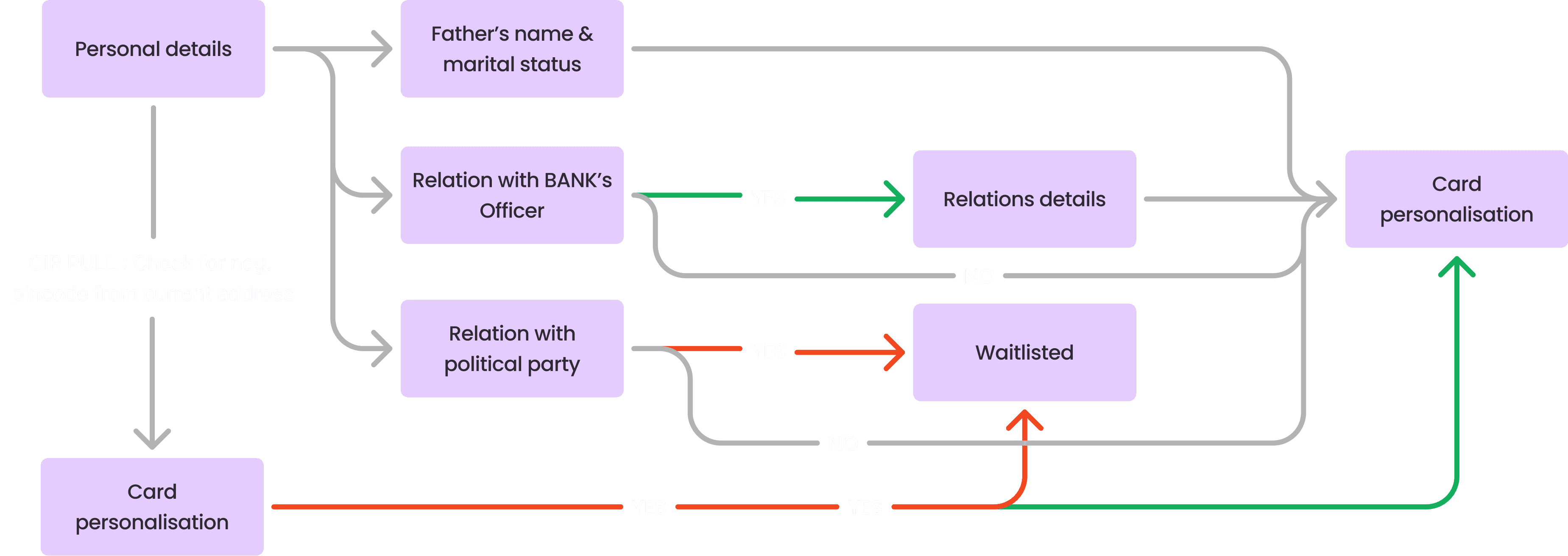
Also, to simplify reader’s understanding here is the basic user flow:


Pre & post VKYC hours
Agent unable & auditor reopen
Agent and auditor reject
Waitlist
Post application approval
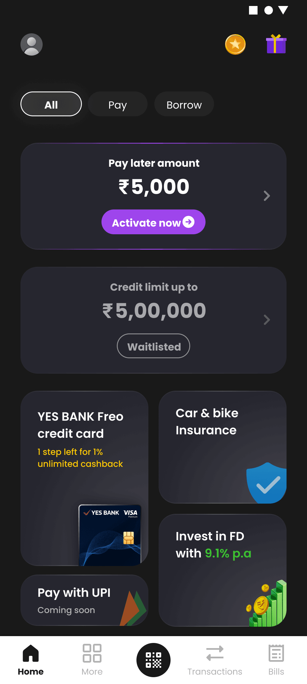
1.7 Status Banner mapping
We decided on the size & placement of this product on the homescreen based on the priority since it was a brand new product for us. We wanted to test out in the smaller space before giving it more importance.
Some guidelines that I decided upon after having discussion with our lead designer who is the owner of One app and Homescreen
• Text in banners cannot go beyond 4 lines, unless very important
• Frontloaded copy with abbreviations wherever possible
• Coloured text for states where action is required for to inform
⚙️ Revision post release
Post released we tracked the performance for 2 months where we saw ~10% drop-off at Company’s address event
Essentially user only had to fill 2 fields but we were showing 5 fields in that step.
✅ We integrated Google maps API to show office addresses along with manual entry.
✅ Built trust through a reassuring tooltip and reducing redundancy.
OLD DESIGN
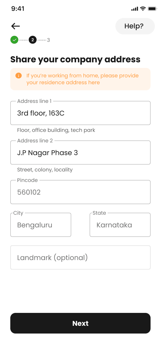
NEW DESIGN

📝 Learnings & Reflection
Since this was my first project in the fintech industry I had quite a few of them :
• Leveraging Available Information for Process Optimization : we were able to identifying opportunities and make informed decisions that minimised user friction, personalise the experience, and optimise the overall application flow.
• Understanding marketing funnels : Identifying key metrics within the funnel allowed for data-driven decisions that improved the overall user experience and increased application completion rates
• Ensuring Consistency Across User Touchpoints : By aligning the messaging, visual design, and user flow across the sales page and application journey, we created a unified experience that reinforced user confidence and reduced friction.
• Tailoring Credit Card Offerings : understanding personas and mapping these to the unique selling propositions of each credit card were crucial in ensuring that the right audience was targeted with the appropriate marketing strategies.
🎊 Impact 🎊
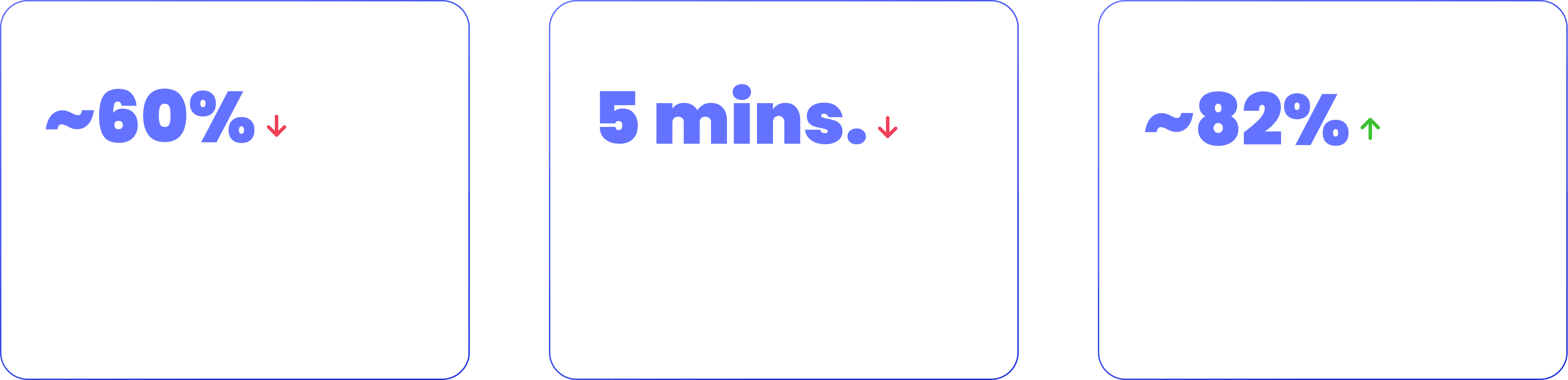

What rolled out!!!